

Project: Unmade
(Work made for with Andy Lemon)
An ongoing concept design and illustration project for Andy Lemon's concept album, Project: Unmade (henceforth P-Unmade) is a collection of songs 'made in the 1980s' for 'an RPG that was scrapped'.
I was tasked with using provided character themes to design the main party of characters from the concept phase and the concept album's cover, with Yoshitaka Amano's work from the chosen time period as my main reference point/style guide. As such, much of the work done was made on paper and scanned as I wanted to use traditional materials as Amano did/continues to do. As the project is still ongoing, the work seen below is of my concepting process and quick sketches I made to figure out the personalities of the characters and how they carry themselves when they stand, how they would move, etc.
All fungi references were pulled from East London Nature with permission from the owner.

01
The Princess | The Female Lead
The Princess was the protagonist, I wanted to go for a more armoured design as generally, a lot of main characters in RPGs from the 80s used a sacred sword of some kind (see: Fire Emblem, Final Fantasy, Dragon Quest, etc). That said, I didn't want the design to be reused male armour, nor did I want it to be hyper-sexualised as the 'game' was geared towards younger audiences.
Instead, I designed the character to use an armoured gown. Rather than give her long hair, I decided instead to have her hair tied back and create the silhouette of longer hair with a circlet that had a veil attached.
02
The Lancer | The Male Lead
Unlike the Princess, I didn't have much information on the Lancer. I was told the character was meant to evoke the scrappy, young hero. Firstly, I picked an overall visual theme that tied the greater cast together: Fungi. (Keep in mind, the Princess was intentionally left out to evoke the isolation of her status).
For the Lancer, I went for a more streamlined design to follow triangle shape theory. The fungus used as a reference was the Chicken in the Woods (see right) as I liked the imagery of twisting and twirling that it evoked almost like a tornado. With the 'Scrappy Hero' concept in mind, I created an initial design that was far less ornate than that of the princess. To emphasise the difference I added ribbons, visible pins with straps and ties to hold the cloth together with an uneven haircut/undercut.

Above: the final design of the Lancer

Above: the initial design of the Lancer
Below: The Zoned Tooth fungus.

It was after this initial design that I was told the Lancer needed to be more masculine. So I decided to shift gears and put the character in a suit (seen to the left). I wanted to make a character that was a bit more modern than the Princess, so I gave the suit a more modern flair. The cravat and ruffs were intentionally made to be far too dramatic.
The overall goal was to make a design that was too exuberant in reference the 'scrappy hero' archetype. Furthermore, I wanted to emphasise how much the character did not fit into their own design like a fish out of water, the hero who left their small town. In reference to the affiliation between the Lancer and the Princess, I added epualets. Nevertheless, I wanted the character to be both too small for their gear as well as the gear being too strict/tight for the person wearing it.

Above: the final design of the Swordsman


03
The Swordsman
The Swordsman was described to me as a wandering mercenary/rogue. Initially, I considered looking up references for a rounin aesthetic, but given most of the 'in-game' narrative was inspired by fae, I was a little skeptical. That was until I found the inkcap mushroom on East London Nature's website. It immediately evoked ideas of a wandering swordsman that left places stained with his footsteps and his choices. Some places were left better by what he did, others less so.
Furthermore, one of the images on their site had an earlier stage of the mushroom that looked like a bamboo hat. From there, I remembered that the sengoku period was roughly occuring at the same time as the wild west. As a result the Swordsman's design is an odd mix of the two principles of a wild west wandering outlaw and a rounin.
He wears a pinstripe suit, the blazer's wide-collar and lapel are flipped up to hide his face with the bamboo hat type. His legs are covered in dust protection and he carries a long sword at his side.
Above: Inkcap mushrooms used as reference from East London Nature.
04
The Mage
The mage was meant to be a bit of a plucky sidekick character, fun and bubbly. Using a magpie inkcap as reference, I liked the pattern of ocean waves on the surface and used it to design a two layered dress for the character and gave her a space buns to further the roundness of the design.
The entire point was to set her apart from the more dangerous and insidious natures of the other party members. I didn't want to use squares in the design because that would make her too 'reliable', so I went with circles to emphasise her bubbly nature.

Above: The Mage final design

Above: Magpie Inkcap from East London Nature
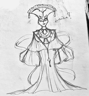

05
The Witch
The principle theme behind the witch was to make her indecipherable. Her actions had far-ranging, obvious consequences but she herself was hard to visualise let alone understand. As a result I went with a design that was very 'flowy'. Her gown is long and what isn't covered by it, is covered by her headdress and her mask. There isn't a part of her body that isn't hidden or obscured. Her movements can only be understood by the movement of her dress, almost like sand or water.
I gave her a floating scarf to mimic the ties of fate, but overall, she has an incredibly simple design. -Although, simple doesn't necessarily mean easy.
The fungus used as reference was The Chicken of the Woods (see left). A fairly simple fungus at first glance, the shape mimics ruffles and fabric folds and layers which was something I wanted to mimic in the Witch's design.
06
The Free Sketches
This was the stage where I made a bunch of free sketches using the characters to figure out the personalities of the characters a bit more, practice their designs and how I could potentially pose them in the thumbnails.
A lot of my sketches were of the Lancer, the Princess and the Witch as they were unofficially the 'main trio' of the 'game' and I wanted to focus on their movement a bit more.


07
The Thumbnails
After the character designs were agreed upon and I had a feel for the kind of movement that fit the characters, I started making thumbnails for the album cover. I was given the all clear to use more baroque/rococo designs and filigree, so I decided to use them in the designs for the Princess' sword. You will also note that the bottom right thumbnail in the beside image uses Bernini's Ecstasy of St Teresa as a pose reference.

In the end, I went for a design that was a cross between the top left and bottom left thumbnails to the left. Of the top left thumbnail, I liked the twirling pose of the Witch and the way that the flow of fabric made her look like sand in an hourglass. The bottom left image was in keeping with older RPG cast banners, and I liked the way the Swordsman looked but overall, in trying to keep all characters equal, the characters got lost in the composition. That went especially so for the princess who got subsumed by the ghost of the Witch.


I made two final thumbnails for Andy to pick between (as seen above) and while we both liked the design to the right, we felt it was too desolate and looked better as a promotional art rather than for an album cover. As a result, we went with the left thumbnail even though at the time it was incomplete since I wanted to ask Andy's opinion as to where to place the mage. He suggested in line with the lancer which gave me an idea for more direct interaction with characters, as seen below.
08
The To-Scale First Draft
After deciding on a composition, I made a larger and more detailed version of the thumbnail to scale. As stated before, I wanted more character interaction between the characters and I found the best way to do that was to not design the Mage and the Lancer in isolation. Instead, I had the lancer carrying the Mage along as if in the midst of a combo attack. Andy agreed it was the best choice and then gave me the go ahead to start the colour test.

.png)
09
The Colour Palette test
I grabbed a photo and put it into Clip Studio. I didn't want to get stuck in the details and end up rendering the image, so I instead just used colour and multiply layers to place colours. I wanted the characters to be distinct from afar. Using Yoshitaka Amano's illustration for Dissidia Final Fantasy as a reference, I chose a fairly simple colour pallet. With Aine and the main background primarily using gold, the other characters were painted in more de-saturated hues (purple, reds, and incredibly de-saturated blues in place of grey).